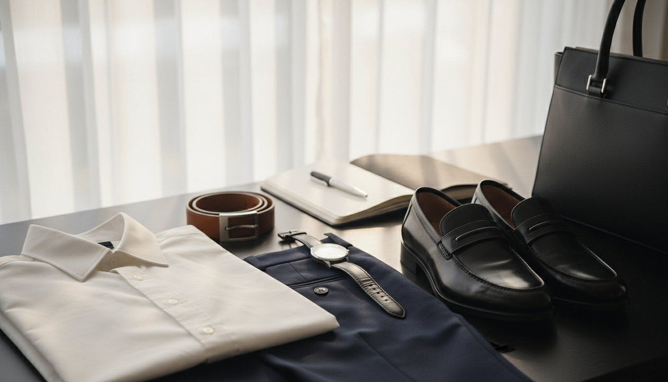
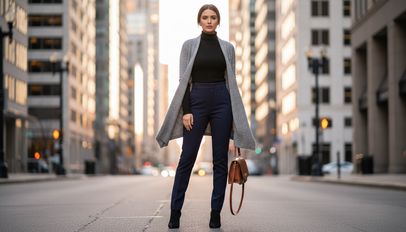
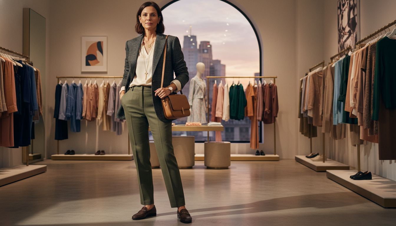
I keep fashion simple: start with one reliable piece from your wardrobe and build a look around it. Use one focus hue, then add neutrals to calm the whole thing down.
You can wear between one and seven colors depending on how many items you use. Monochrome looks, bold contrast, soft blends, neutral bases, and neutral-plus-color are five easy methods you can try today.
When a look feels too bright, one neutral will usually fix the mood. I’ll show when contrast helps, when different shades should be kept close, and how texture and shine act like extra hues to add depth without more pieces.
Key Takeaways
- Start with a core clothing piece, add one focus color, then anchor with neutrals.
- Use monochrome looks or classic complementary combinations when you want a quick win.
- Keep tones consistent; similar temperature keeps the eye happy.
- One neutral calms an overly busy mix of shades and brings a cohesive look.
- Texture and shine can replace adding new colors and still make your clothes feel layered.
Struggling to match colors? Here’s how to make outfits feel effortless right now
Let one favorite piece lead the way. Pick the top or dress that makes you smile, then build the rest of your look around it.
When you’re unsure which pieces to grab, choose one focus shade and add two easy neutrals from your wardrobe. That simple formula — one color, two neutrals — saves time and mental energy.
Soft combinations work when you pair light-with-light or dark-with-dark. They keep your mood calm and cut down attention when you want to blend in.
- If the look feels loud, add one neutral layer like a gray blazer to settle the mood.
- Match colors with the same temperature so the whole look reads as intentional.
- Use texture — ribbed knits or suede — to add interest without more shades.
| Problem | Quick Fix | Result |
|---|---|---|
| Too many competing shades | Add one neutral piece | Balanced, calmer look |
| Morning rush, unsure what to wear | Pick one favorite, add two neutrals | Fast, repeatable outfit |
| Outfit feels flat | Mix textures at same tone | Depth without extra colors |
Do a quick mirror test: if the look feels off, remove one piece or swap in a neutral. Repeat the formula until it’s an easy habit.
Use the clothing color wheel to guide your choices
Think of the color wheel as a friendly map that shows how hues relate. It helps you use color on purpose instead of guessing when you get dressed.
Primary, secondary, and tertiary colors explained
Primary colors are red, yellow, and blue. They are your basic building blocks in fashion and clothing. Secondary colors come from mixing primaries: green, orange, and purple. Tertiary shades sit between those—think chartreuse or magenta—these are the little shades you spot in stores.
Warm, cool, and neutral tones
Warm hues like red and orange add energy. Cool ones such as blue and purple calm things down. Neutrals—black, white, gray, brown—act as the glue that holds a look together. Use them to frame a bright piece or to tone down contrast.
Analogous, complementary, triadic, and tetradic schemes
- Analogous: neighbors on the wheel—easy, smooth, great for work or weekend.
- Complementary: opposites like blue–orange; they create bold contrast when used in the right proportion.
- Triadic: three evenly spaced hues—playful but balanced if one color leads.
- Tetradic: two complementary pairs—rich and complex; keep shapes simple and let the hues do the work.
Match colors to your skin tone and temperature for a flattering result
A simple daylight test will tell you which shades lift your skin and which drag it down. Hold a cool piece next to your face, then a warm one, and note which makes your eyes pop and your skin look fresher.
Find your undertone: cool, warm, or neutral
First, notice your skin’s undertone. Cool undertones read better with blue-based hues. Warm undertones glow with golden or tan shades. If you’re neutral, you can wear either, but balance helps.
Why same-temperature pairings look more harmonious
Pick colors from the same temperature so your whole look feels calm and intentional. Mixing warm and cool pieces often makes an outfit feel off, even when each item is lovely.
- Use your best hues near your face—tops, scarves, or earrings—to brighten your complexion.
- Be gentle with stark black-and-white if your contrast is low; softer neutral colors may help.
- If you love a hue that isn’t perfect for your skin, wear it as pants, skirt, or bag while keeping the top in your best temperature.
- Make sure you check in natural light before you leave; indoor light can hide small differences in tone and shades.
Color matching tips for outfits you can apply today
A steady neutral foundation makes getting dressed painless. Start simple and repeat a small formula until it feels automatic.
Start with a base
Pick one neutral piece. Think white, beige, camel, gray, brown, or black. That base gives your color a calm place to land.
Add a focus hue and set the mood
Choose one focus shade. Soft pastels make a calm look. Saturated tones read bold. Earthy shades feel relaxed and wear-everyday.
Make sure saturation and temperature align
Keep similar saturation levels. Pastel with pastel, bold with bold. Match warm neutrals with warm hues and cool neutrals with cool ones.
- Two neutrals + one color = fast formula you can repeat from your wardrobe.
- Swap fabrics—ribbed knit, suede, satin—if the base feels flat.
- When it looks busy, remove one shade or swap it for a neutral to get back to a cohesive look.
| Base | Focus | Quick result |
|---|---|---|
| Beige knit | Sage scarf | Calm, office-ready |
| Black trousers | Burgundy top | Smart, slightly bold |
| White tee | Burnt orange bag | Relaxed, everyday |
| Camel coat | Plum accessory | Polished, cohesive look |
Build with low-risk methods: monochrome and soft/analogous combinations
Work with nearby tones and soft contrasts to keep looks calm and polished. These low-risk methods make getting dressed faster and less stressful.
Monochrome made simple
Pick one color you love and use 2–3 different shades of it. Change saturation and brightness so the outfit reads rich, not flat.
Use texture to add shape. Try a matte knit with a satin skirt or a suede shoe with a silk top. That contrast creates interest without new colors.
Soft combinations that work
Pair light-with-light for daytime ease or dark-with-dark for a sleeker feel. Keeping similar depth makes the look gentle and cohesive.
Analogous mixes that flow
Choose neighbors on the wheel and keep saturation similar. A navy sweater, blue skirt, and teal bag is an easy trio that looks polished.
- Limit monochrome to 2–3 pieces so the silhouette stays clear.
- If you mix green, use no more than two shades and keep them both warm or both cool.
- Add one small metal accent—like a gold buckle—to lift a quiet palette.
Create intentional contrast: complementary pairings and neutral + color
Intentional contrast makes a simple look feel thoughtful and modern. I’ll show easy ways to try bold pairs without feeling costume-y.

Complementary pairs that pop
Classic complementary colors include red–green, blue–orange, and purple–yellow. These opposites create immediate contrast and draw attention in a controlled way.
Use the 70/30 rule
Start with one main hue at about 70% of your look and use the opposite at about 30%. That keeps contrast stylish, not shouty.
- Try navy trousers (70%) with a soft orange top or sandals (30%).
- For red–green, pick deeper tones like burgundy with forest green so the combo feels grown-up.
- Pair lavender and mustard by softening one shade—say lavender dress with mustard accessories.
Neutral + color: anchor brights
If a pairing looks too bright, add a neutral—gray, beige, or camel—to calm it. Neutrals give the eye places to rest and make contrasts wearable.
| Pair | How to wear | Quick result |
|---|---|---|
| Blue–Orange | Navy dress (70%), orange sandals & small bag (30%) | Modern, balanced energy |
| Red–Green | Burgundy top (70%), forest green jacket or scarf (30%) | Intentional, not festive |
| Purple–Yellow | Lavender blouse (70%), mustard belt or shoes (30%) | Chic daytime pop |
Make sure you place the brighter hue away from areas you don’t want to highlight. Start with small hits—bag, belt, or shoes—then expand as you get comfortable.
Dial in proportion, saturation, and texture for polish
A few simple swaps in scale, sheen, and saturation will polish any ensemble. You don’t need more pieces—just better placement and one tactile item that reads intentional.
Same saturation, stronger cohesion
Keep saturation consistent. Pair pastels with pastels or deeper shades with deeper shades so your look reads seamless. This reduces visual noise and makes colors feel like a single idea.
Texture and sheen as tools that add depth
Use one textured piece—ribbing, tweed, or suede—to add interest without adding new shades. A touch of sheen like silk or polished leather acts like a highlight and catches light in a flattering way.
When a look feels too bright, add one neutral
If the mix tips into “too much,” add a neutral piece to calm the scene. Put darker shades where you want grounding and lighter tones where you want lift. Let shoes and bag be neutral if both top and bottom compete.
- Keep saturation steady: pastels with pastels, bold with bold.
- One textured item = depth without clutter.
- Add one neutral to balance high contrast and make look polished.
All-neutral outfits that never look boring
Neutrals don’t have to be boring — small details make them sing. I like to build a look around three pieces that differ in texture. Try a chunky knit, smooth trousers, and suede boots. It feels thoughtful without fuss.
Keep temperature consistent. Mix warm neutrals like camel and brown, or cool ones like gray and black. That keeps the outfit refined and easy on the eye.
When you wear all white, use the same shade of white from head to toe. It keeps the clothes crisp and avoids a muddled result.
- Add one metal accent — gold hoops or a chain belt — to give a quiet outfit a soft glow.
- Play with proportions: a relaxed blazer over tailored pants modernizes a neutral style.
- Swap fabrics by season: linen in summer, wool in winter, satin for evenings.
| Strategy | Example | Result |
|---|---|---|
| Texture mix | Chunky knit + silk skirt + suede boot | Depth without new colors |
| Temperature match | Camel coat + brown trousers | Warm, cohesive look |
| Same-white rule | Ivory top + ivory trousers | Crisp, intentional outfit |
| Proportion play | Relaxed blazer + slim pants | Modern silhouette |
Real-world outfit examples that just work
I’ll show plug-and-play looks that you can build from things you already own. These examples use classic complementary pairs and simple ratios so you get contrast that reads modern, not messy.

Blue and orange for modern energy
Try navy jeans, a soft orange sweater, tan loafers, and a beige trench. Blue stays dominant and orange adds a lively note.
Or swap in cobalt heels with a navy dress and a small orange bag to keep the look sharp and fresh.
Red and green that reads intentional, not festive
Pick deeper tones: burgundy trousers with a deep green blouse and nude pumps. The result is elegant, not holiday-themed.
Another easy combo is a forest-green knit, an oxblood bag, and gold earrings for quiet depth.
Purple and yellow for confident contrast
Pair a lavender blouse with a mustard skirt and cream sneakers. The contrast feels friendly and wearable.
At work, try a plum blazer, pale yellow shell, charcoal pants, and black loafers to keep it office-ready.
Shades of green: why mixing more than two can get tricky
Green spans warm and cool tones. Use no more than two shades—sage plus emerald—and keep them the same temperature.
If a combo reads too bright, scale back to accents: a belt, bag, or earrings. Keep silhouettes simple so the colors do the talking.
- Remember the 70/30 rule: make one hue the star and the other the accent.
- When in doubt, treat bright pieces as accents rather than the main piece.
- Simple shapes — tee, straight-leg trousers, sneakers — let color feel intentional.
Common mistakes and quick fixes
When pieces fight, the fix is usually one tiny swap and a clear anchor. I’ll show quick checks you can do in minutes that calm a look and make your clothes feel intentional again.
Warm-and-cool clashes: how to spot and solve them
If your top reads warm and your jacket reads cool, the combo will look off. Check temperature first; it’s the most common clash.
Fix it fast by swapping one piece so all hues sit in the same family. The outfit will calm immediately and read cohesive.
Too many colors, no anchor: add a neutral and define the main hue
Too many different colors with no main piece feels busy. Pick one main hue and add a neutral jacket, shoe, or bag to steady the scene.
Let one item lead. Reduce how many pieces carry color and the look becomes intentional, not chaotic.
Monochrome mishaps: vary depth and texture to avoid flatness
Monochrome can go flat if everything is the same shade. Add a darker or lighter tone and a textured piece to give depth.
A subtle shine like satin or a knit with ribbing lifts the whole look without leaving the palette.
Mismatched whites and harsh black-white on low-contrast complexions
Mismatched whites can look dingy. Keep the same whites together or separate them with a belt or neutral to avoid muddiness.
If stark black-white overwhelms your skin tone, soften it with gray, ivory, or beige. It flatters low-contrast skin and keeps contrast gentle.
| Problem | Quick swap | Result |
|---|---|---|
| Warm next to cool | Swap one piece to match temperature | Calmer, cohesive look |
| Too many different colors | Pick main hue + neutral anchor | Balanced, intentional outfit |
| Flat monochrome | Add depth: different shades or texture | Richer, layered appearance |
| Mismatched whites / harsh B-W | Align whites or soften with ivory/gray | Cleaner, flattering result for skin |
If you’re stuck, take a quick photo in daylight. Camera feedback makes clashes obvious and tells you what to change. Make sure your accessories support the main hue; if they don’t, swap to metal or neutral and you’re done.
Conclusion
.
Small habits in how you pick pieces will change the way your whole wardrobe works. I want you to feel ready, not overwhelmed. Use the color wheel as a guide, not a rulebook, and start with one favorite hue plus two neutrals.
Remember the 70/30 rule to keep contrast wearable. Keep temperature and saturation consistent and repeat your focus shade once so the eye reads one clear combination.
You can mix more than three colors and still look great. Fit, proportion, texture, and confidence finish the job. Practice simple primary colors in small doses, then try triadic or tetradic combinations as you grow bolder.
Trust daylight and your mirror. If you feel like you, that look is right. Have fun with fashion and let your clothing support your day.