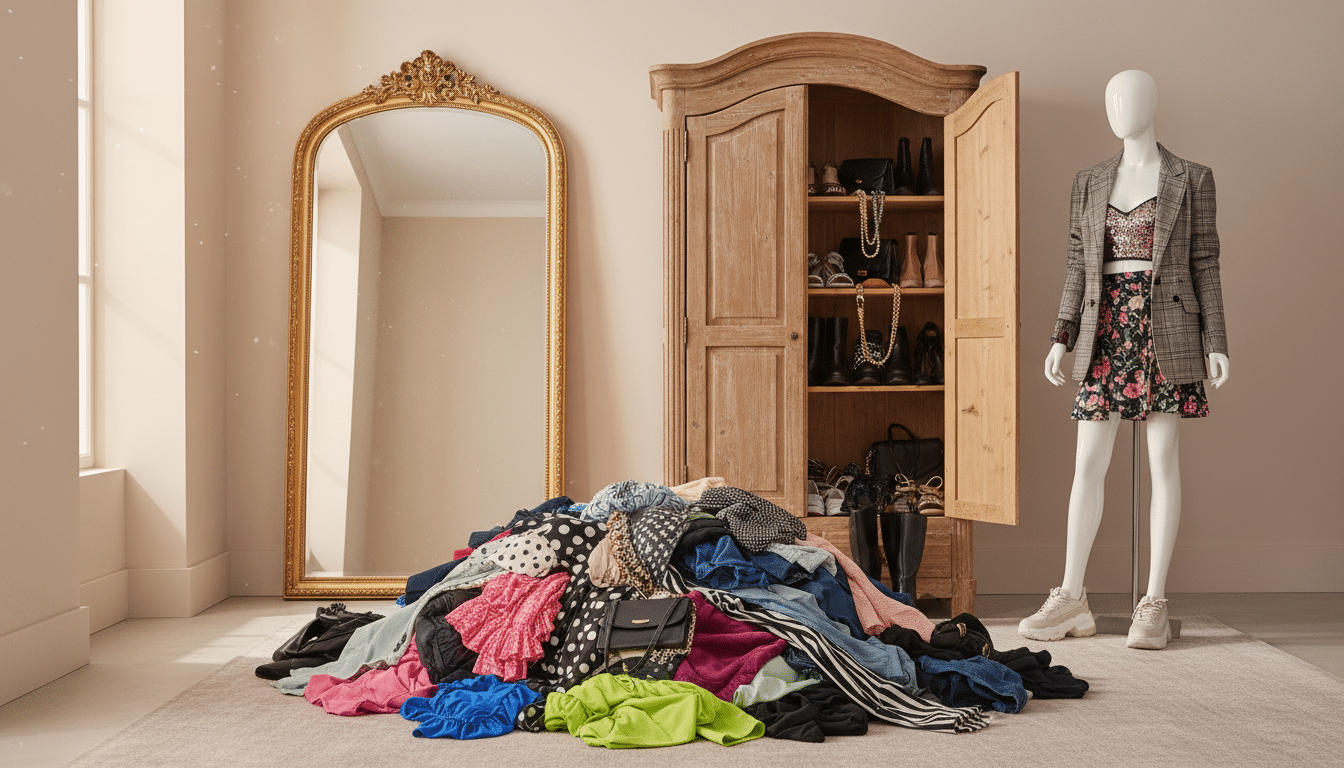
I use “colors for capsule wardrobe” as my compass when my closet feels chaotic—too many pieces and nothing that plays well together.
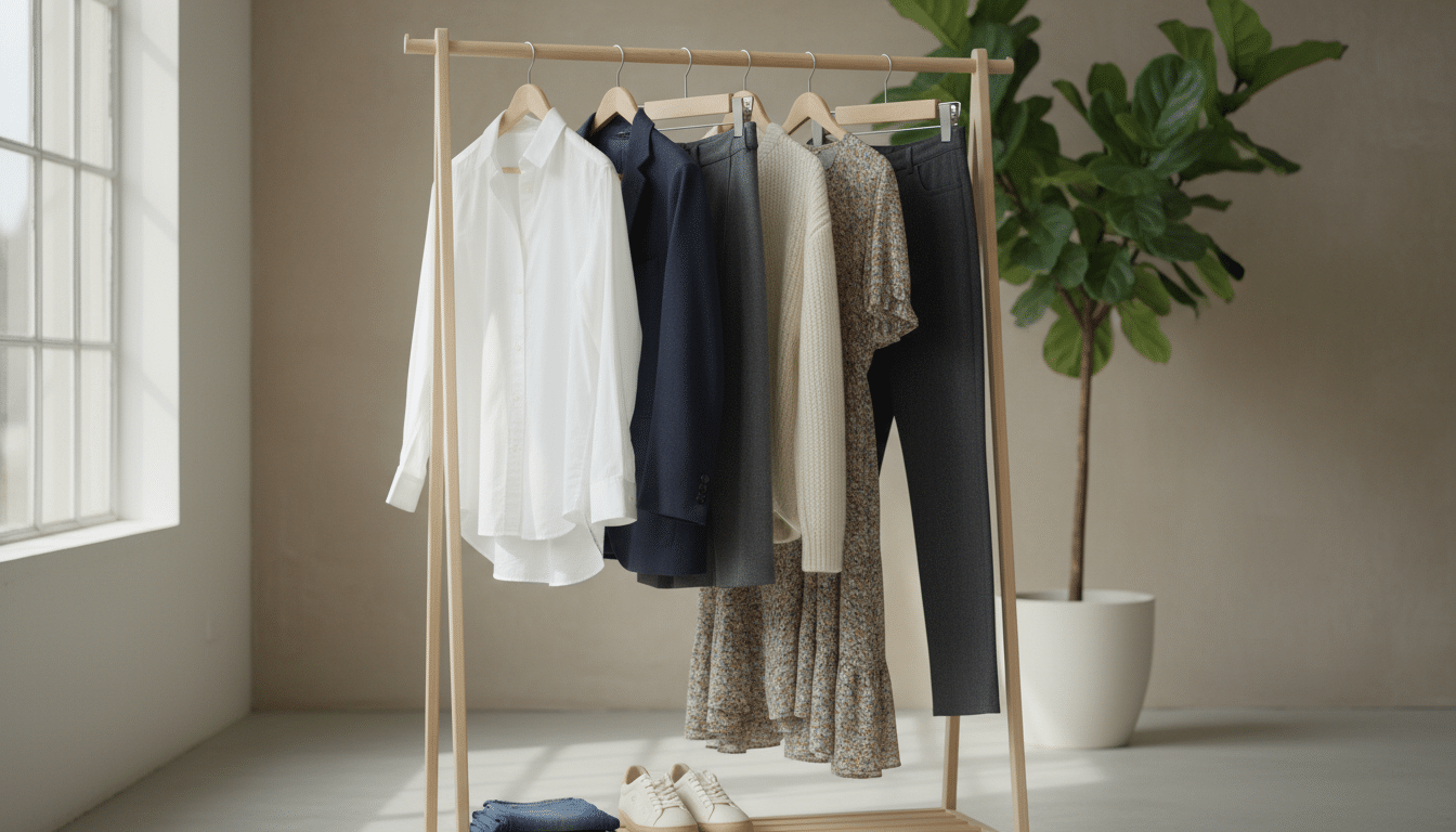
When I talk about a capsule wardrobe, I mean fewer items that mix easily so you get more real outfits. Color is the fastest way to make a small set of clothes feel larger and intentional.
I’ll walk you through a simple method I actually use: start with what you already wear, note seasonal rhythm, pick a base and a few accents, check undertones, then test mixability. No color theory degree needed—just honest closet clues and small decisions that add up.
If your daily routine feels stalled by choice anxiety, this short guide will help you make clearer picks and save time. I promise practical steps, gentle prompts, and examples you can try this weekend.
Key Takeaways
- Begin with pieces you actually wear—your closet gives the best clues.
- Make color the first organizing step so outfits form naturally.
- Build a base-and-accent color palette, then test mixability.
- No expertise required—focus on undertone and saturation, not perfection.
- Small edits and a simple shopping filter speed up every morning.
Start with your real closet, not a fantasy color palette
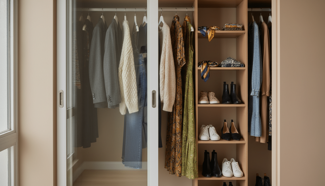
Your real closet speaks louder than a pretty mood board—listen to what you reach for. Take a calm, 30-minute sweep and pull the garments you truly wear. This is the single best step to honest palettes that actually work.
Why copying someone else’s colors usually falls apart
Pinterest and influencer feeds often push neat, neutral mixes that look great in photos. Those tones can fail on a weekday because your life, shape, and comfort are different.
Colors that flatter a mannequin may feel odd on you. Don’t force trends—let your closet vote.
The “absolute favorites” method
Pull only pieces you reach for without thinking. If you wouldn’t happily wear an item this week, it doesn’t belong in the favorites pile.
This reveals repeatable outfits and honest options you already own.
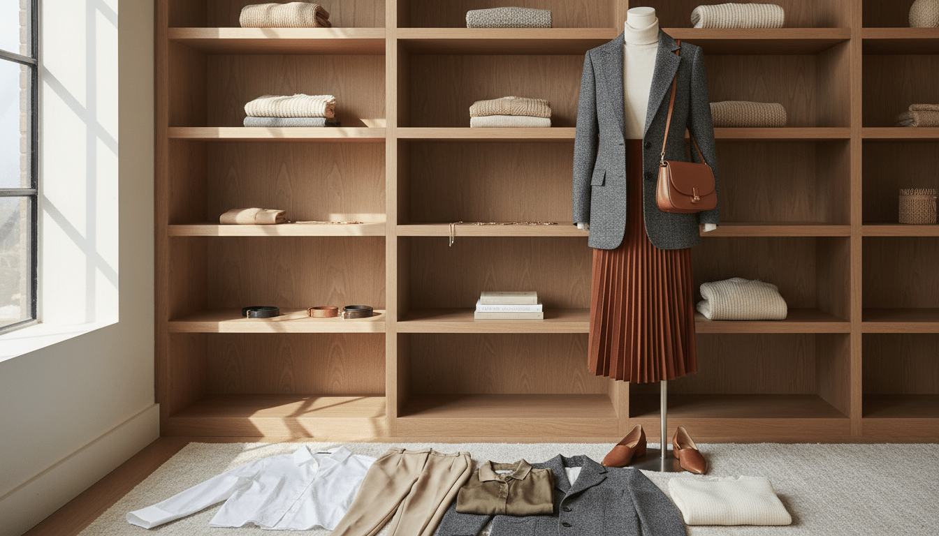
A simple seasonal pile: clothes, shoes, bags, and accessories that earn a spot
Pick one season—summer or winter—and gather items across categories. Aim for about 25–30 clothing pieces and 10–15 shoes, bags, and accessories. If you grab half the closet, treat that as data, not failure.
| Category | Target Count | Quick Example |
|---|---|---|
| Clothes | 25–30 | denim, black pants, white tees, knit |
| Shoes | 4–6 | tan boots, white sneakers |
| Bags & Accessories | 6–9 | neutral bag, scarves, belt, simple jewelry |
Decide how many capsule wardrobes you want for the year
Set a rotation that matches your calendar and climate, and the rest of your plan falls into place. I’ll walk you through two simple options so you can pick the one that fits your life.
Quarterly seasons vs. a two-season rotation
If you rotate every three months, you’ll likely create four palettes. That works if you enjoy seasonal swaps and small, clear resets.
Rotate every six months and you’ll usually make two palettes: spring/summer and fall/winter. This way saves time and reduces planning pressure.
How your lifestyle and U.S. climate change the plan
If you live in Minnesota, winter feels like its own universe—deep tones and heavy layers. In Southern California, you might live in one long light-jacket season and barely need a separate winter set.
Your day-to-day life matters too. If you work from home, you need fewer formal pieces than a commuter who meets clients. Let your daily routine guide the number of capsules you pick.
- I’ll help you choose the number you actually want—this cuts decision fatigue.
- If your closet feels chaotic, start with two capsules as a quick, calming option.
- More capsules mean more planning time, but less daily choice if you love seasonal rituals.
Build your colors for capsule wardrobe with a base-and-accent system
I recommend a base-and-accent plan—it keeps mornings calm and shopping sane. Start with easy rules, not theory.
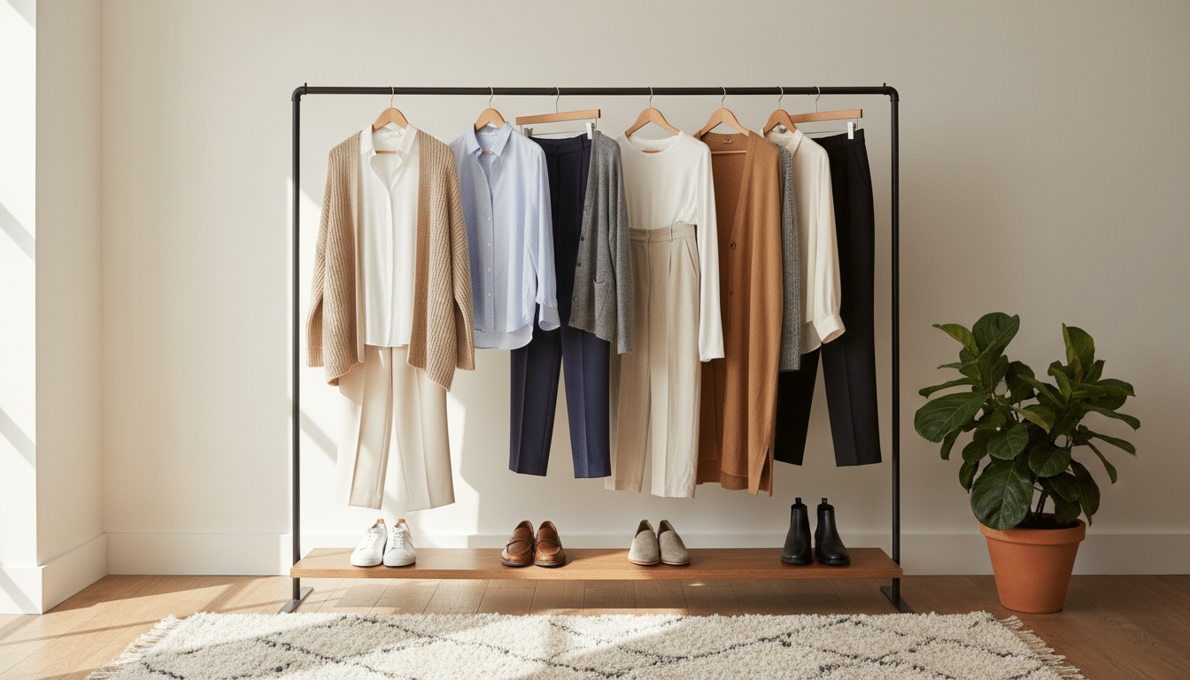
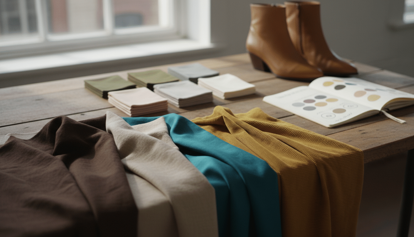
Base means the workhorse shades you lean on for jeans, pants, jackets, and shoes. These are the pieces you reach for when you hurry. Pick two to three bases that show up across bottoms and outerwear.
How I spot bases fast
I look at what I wear on busy days—those items reveal my true base. If your jeans and favorite jacket share a tone, that’s a base. Keep those as anchors.
Accent choices that add personality
Accents give contrast without breaking mix match rules. Use them in a top, dress, bag, or scarves so one pop lifts many outfits.
- Neutrals: your anchors (black, ivory) — pair with everything.
- Main colors: frequent favorites (denim blue, olive, camel).
- Accent shades: pops (burgundy, soft pink) that still pair with two mains.
Patterns count as colors
Treat stripes, checks, and animal prints like hues. Decide if a pattern behaves as a base pattern or an accent pattern based on how often you wear it.
My mixability rule
Every accent must pair with each neutral and at least two main colors. If it doesn’t, it becomes an orphan item—and that’s how closets bloat.
Refine your palette with undertones, depth, and saturation
A small tweak in undertone or depth can turn a “nice” shirt into one you actually wear every week. I’ll keep this simple so you can test at home without drama.
Warm, cool, or neutral—try the white vs. ivory tee test
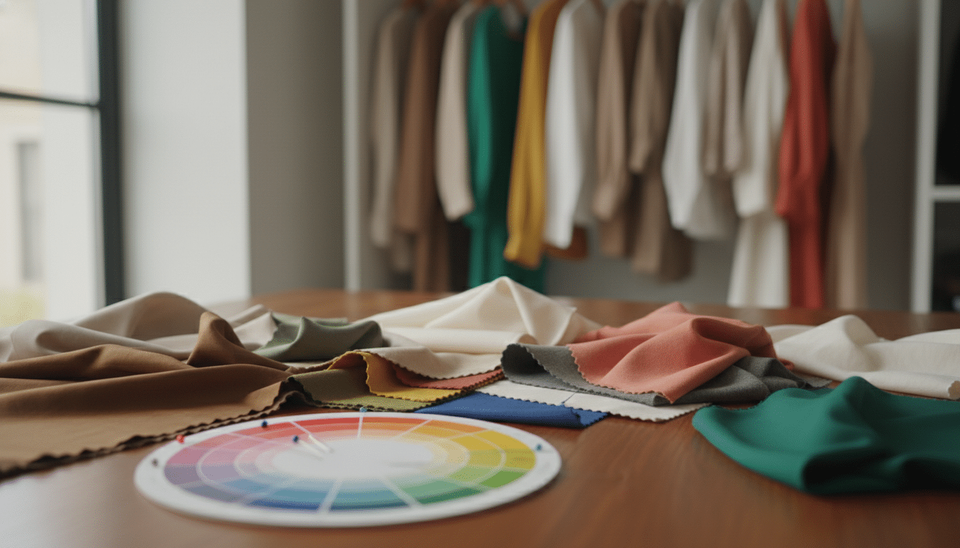
Stand by a window and hold a true white tee next to an ivory tee near your face. Watch which one makes your skin look brighter and less shadowed.
If white makes you glow, you may lean cool. If ivory softens and warms your face, you may lean warm. If both work, you’re likely neutral. No labeling—just what helps you feel alive.
Depth and saturation: muted vs. bright
Think light versus deep and muted versus bright. A soft navy or deep olive often feels easier to wear than jet black or neon green.
Muted shades hide stains and pair more easily. Bright shades can be joyful, but you may reach for them less when you hurry.
| Trait | What to test | Practical pick |
|---|---|---|
| Undertone | White tee vs ivory tee by your face | Choose the tee that makes you look rested |
| Depth | Light vs deep versions of same hue | Pick the depth you wear most often |
| Saturation | Muted vs bright samples | Favor muted or slightly deep shades for daily wear |
Contrast level and real-life light
Harsh black-and-white can feel loud. If that’s true for you, try charcoal with cream or navy with ivory. Place bold pieces farther from the face—bags and shoes—so your tops carry your best look.
If you want a quick cheat sheet, see these color-matching tips that make sense. They help you lock a practical palette and stop buying things you never wear.
Make sure your capsule wardrobe colors mix easily in real outfits
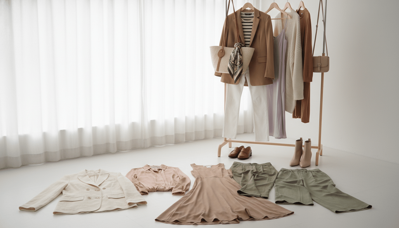
I test every new shade by building three real outfits before it earns a permanent place in my closet. This simple practice shows where the palette holds and where items become orphans.
The mixability check: build outfits on purpose
I literally make three outfit groupings with a new top, bottom, and layer. If each top can pair with at least two bottoms, you pass the mixability step.
Use neutrals as anchor pieces
Neutrals act like connectors. If a piece won’t sit with your jackets, shoes, or pants, it becomes an orphan.
My rule: have two strong neutrals and one main accent. That way most items link into outfits without extra thought.
Place your best shades near the face and test in both light
I put my best tones in tops and scarves so my look reads well. Tricky hues go to shoes or bags instead.
Always check a coat or dress in daylight and indoor light before you commit. Store light often flatters. Daylight shows the true result.
| Check | Quick test | Result |
|---|---|---|
| Outfit trial | Make three outfits | Pass if each top pairs twice |
| Neutral anchors | Count base pieces | Need 2–3 neutrals |
| Light test | View in daylight + indoor | Buy only if both work |
Keep shopping simple with a color filter you can actually follow
A simple shopping filter saves time and stops impulse buys before they sneak into your cart. I use a tiny checklist that tells me yes, no, or maybe—so decisions feel easy when I’m tired or scrolling late.
Start with a short yes list and a no list you can remember. Treat prints and patterns the same way: if a pattern doesn’t link to two base pieces, it’s a no. This prevents the domino effect where one new hue quietly needs new shoes, a bag, and extra tops.
Your “yes list” and “no list”
- Yes: navy, cream, olive, burgundy — items that pair with at least two bases.
- No: neon brights, clashing high-contrast patterns, one-off shades you can’t imagine with three outfits.
- Maybe: seasonal experiments you’ll test as accessories first.
Pick accent categories on purpose
Decide where you want accent pieces—tops, scarves, or bags. If you rarely wear colored pants, skip buying accents there. This keeps your closet cohesive and saves money and time.
| Choice | When to buy | Why it works |
|---|---|---|
| Accessories | Try first | Low-cost test of an accent without a big commitment |
| Shoes | Buy if matches 3 outfits | Shoes can anchor looks, but they must link to bases |
| Bags & belts | Only if they pair with neutral bases | Add color safely and useful across outfits |
| Tops & dresses | Buy sparingly | These sit near the face — test in daylight first |
My calm rule: if you can’t name three outfits with what you already own, hold off. That one cute piece will often become five purchases—unless you make the choice a yes or no ahead of time.
Conclusion
A practical palette earns its place when you stop thinking and just get dressed.
I’ll keep this short: start with your real closet, pick a season rhythm, sort base versus accent (patterns count), tweak undertone and depth, then run a mixability step before you buy.
You don’t need to nail the whole plan in a day. Watch what you reach for and refine over time. Small edits teach you what you actually like.
Quick next step: pull an “absolute favorites” mini-pile and list the repeating colors you see. That list is your real starting point.
When the palette clicks, mornings feel easier—you grab two or three pieces and leave. That’s the end goal: fewer decisions and more outfits that feel like you.